I love the design side of beer. It doesn’t effect the taste, and it certainly doesn’t effect the taproom experience – at first glance it might even seem like it’s a tiny portion of the whole thing, and thusly might be insignificant. I am a firm believer though that this is pretty far from the truth. There aren’t many aspects of a brewery’s product that have the ability to convey the brand, the story of the brewery, and even the story of the individual beer quite the way that the packaging design does. It’s largely for this reason that you’ll see so many pictures of packaging here on the website – I freaking love this stuff.
That might explain a little bit why I get so amped up when a brewery takes a step back and reimagines what their look is going to be, the way the Rivertown is currently in the middle of doing. I talked a little bit about the changes when they were first revealed earlier this summer, and if you wait until this next Monday, you’ll find a lot more talk about it in the next episode of Cincy Brewcast.
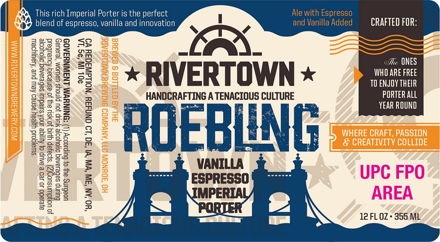
Today we’re seeing the next piece of it the packaging – Roebling has it’s new look finally!
About Roebling Porter
This was a beer that was first brewed in 2011 to celebrate the 145th birthday of the John A Roebling suspension bridge that links Cincinnati and Covington. I’m not sure that the brewery knew quite the following that they were going to create with this beer, one which might only be rivaled by their Pumpkin. The beer is now beloved by fans across the country who love their dark beers – regardless of what season it might be.
This is all celebrated in the new packaging. It tells us that this is a beer that is crafted for:
The ones that are free to enjoy their Porter all year round.
The label picks up on the current look of their new labels rolling out, and uses a bright blue image of the bridge itself to set it apart, and let you know exactly what is held inside it’s glass confines.
As for when you’ll start seeing this appear on shelves? Soon…ish? The brewery is going to roll through their current stock of the “old design” first before kicking things into a new gear with the new look – so collectors… you’ve got your warning!