
It’s been a big year for the veteran Rivertown Brewing Company. They finally opened their doors to a facility that in my eyes finally starts to complete the vision of what Rivertown was supposed to look like from the beginning, back in 2009.
If you haven’t been up to Monroe to see the new facility, yet – or try the food, it’s probably something that should be really high on your “Brewery To-Do List” for this summer. This post, though, isn’t about the new brewery – it’s about them tying things together and kicking things into high gear.
What Rivertown looks like has changed a lot over the years. It’s become more polished or more refined as the years go by. I thought that it might be fun to take a little trip through the different company brand design that we’ve seen before we end up with what if my unconfirmed guessing is right looks like a new look for their packaging.
The Rivertown Branding Shift
Looking at the brewery’s logos over the past years, you can literally see the personality of Rivertown starting to shift and change with the revision of the Brand Standards surrounding it. While the Rivertown “Riverboat Logo” captured a lot of the personality of the brewery when it opened, it didn’t quite keep it modern with the changing beer market not just here in Cincinnati, but all across the country (Where the brewery distributes a lot of beer).

The move into the current “Paddle Wheel Logo” took them from a pieced together startup brewery, to a well-polished massive facility that is known all across the country. They’ve earned their polish over these years, and the newest logo forms the backbone, and the base for everything that defines the look of the Rivertown of today. The new logo is something they can be proud of and will look great on labels, signs and company uniform/clothing (which you can buy and personalise from Imprint), allowing them to build an easily recognisable brand.
The Rivertown Packaging Shift
Again, it’s easy to see Rivertown’s literal growth when you look back at their labels over the years. They went from a brewery that had to put tougher their own artwork, without the help of a designer to a look that really starts to capture some of essence of the city that they call home.
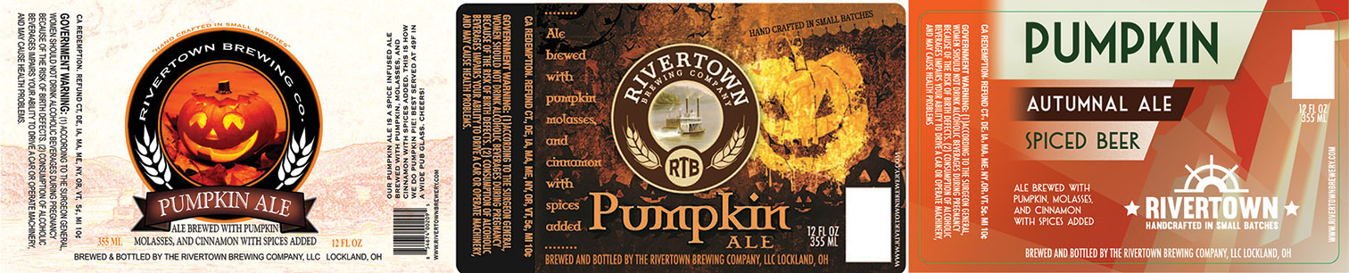
The current brand is an “old meets new” mixture that is a lot of what the Lockland Rivertown was all about.
It All Leads To This
 Rivertown isn’t a mish-mash anymore. It’s not really “Old Meets New”, the way it was when Lockland was the home base. The Rivertown of today is a state of the art production facility, a fantastic barbecue restaurant that houses some boundary pushing sour beers.
This new label just came through the TTB approval process and it says a lot about who Rivertown sees themselves in today’s beer market. It’s bright – it’s polished and classy. There are clear descriptions of the beer and what drinkers can expect when they crack it open.
There is still a classic look to the label, it harkens back to yesterday, while focusing fully on today and recognizes that Rivertown is looking squarely on the future of craft beer and how they can shape what that looks like.
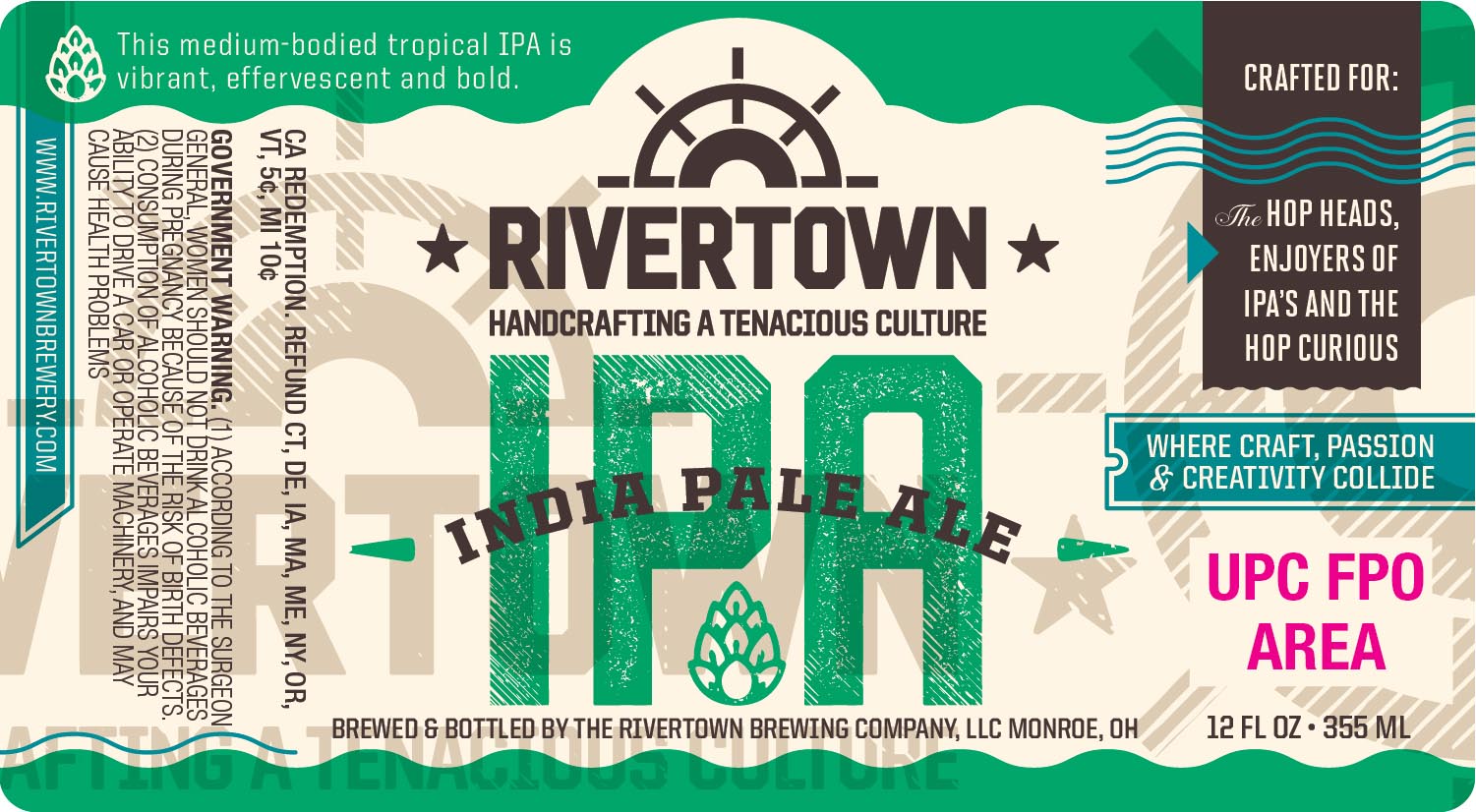
Wait… Rivertown IPA?
One more thing you should note – this is a new beer. While Rivertown might be happy to tell you how Sour is the new hoppy, I think it still goes without saying that people like their IPAs. If you’ve stopped by Rivertown recently, you might have noticed them playing around with the style. (a Grapefruit DIPA, and an Experimental IPA were on tap when I was there the other day.)
The description of the beer reads:
This medium-bodied tropical IPA is vibrant, effervescent and bold.
It also specifies who the beer is for: The hop heads, enjoyer of IPA’s and the ‘Hop Curious’.
So… be excited about new recipes… be excited about a new look – but overall, just be excited about a new approach and a new attitude. They have embraced and started to really define what it means to craft a tenacious culture.
Stay tuned as more details about this start to come to light – I’ll let you know as soon as the brewery confirms all this, and fills in a lot of the blanks that are still waiting to be filled.
UPDATE – More Label Approvals!
Well… we didn’t have to wait long for that! Two more labels rolled through today, giving us a glimpse at not just two new labels, but two new beer names as well. Classic styles, easy drinkers… this is looking good for all the people who have been clamoring for this!
 3984
3984
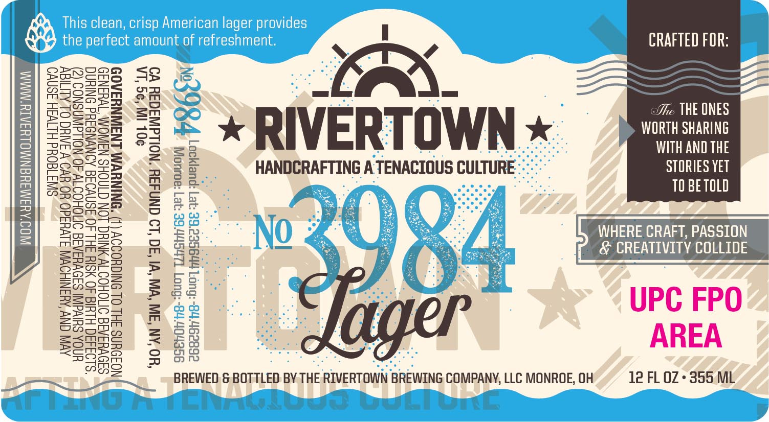
American Lager
This clean, crisp, American lager provides the perfect amount of refreshment.
A fantastic homage to the Cincinnati area, which sits right at the 39th parallel latitude and -84 longitude, this beer is a beer that is brewed for a city that loves it’s lagers. The brewery says that it’s crafted for ‘The ones worth sharing with, and the stories yet to be told’.
 Ember
Ember
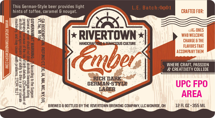
A rich, dark, German-Style Lager
This German-Style beer provides light hints of toffee, caramel, & nougat.
Again… with the easy drinking lagers that this city literally swoons over. The beer is crafted for: ‘The ones who welcome change & the flavors that accompany them’. I can only assume that this is the Dunkel lager that they’ve been pouring up in Monroe lately… and if that’s the case, I can’t wait to get it in my fridge.